Examining the results
After the results have been obtained, it is important to be able to examine the results easily. The results can be examined either numerically by inspecting numerical arrays or visually by plotting distributions of the nodes. In addition, the posterior distributions can be visualized during the learning algorithm and the results can saved into a file.
Plotting the results
The module plot offers some plotting basic functionality:
>>> import bayespy.plot as bpplt
The module contains matplotlib.pyplot module if the user needs that. For
instance, interactive plotting can be enabled as:
>>> bpplt.pyplot.ion()
The plot module contains some functions but it is not a very
comprehensive collection, thus the user may need to write some problem- or
model-specific plotting functions. The current collection is:
pdf(): show probability density function of a scalarcontour(): show probability density function of two-element vectorhinton(): show the Hinton diagramplot(): show value as a function
The probability density function of a scalar random variable can be plotted
using the function pdf():
>>> bpplt.pyplot.figure()
<matplotlib.figure.Figure object at 0x...>
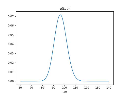
>>> bpplt.pdf(Q['tau'], np.linspace(60, 140, num=100))
[<matplotlib.lines.Line2D object at 0x...>]
(Source code, png, hires.png, pdf)

The variable tau models the inverse variance of the noise, for which the
true value is  . Thus, the posterior captures the true value
quite accurately. Similarly, the function
. Thus, the posterior captures the true value
quite accurately. Similarly, the function contour() can be used to plot
the probability density function of a 2-dimensional variable, for instance:
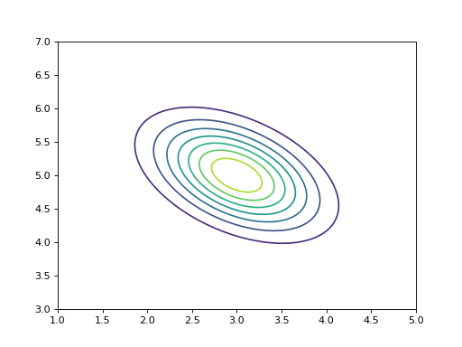
>>> V = Gaussian([3, 5], [[4, 2], [2, 5]])
>>> bpplt.pyplot.figure()
<matplotlib.figure.Figure object at 0x...>
>>> bpplt.contour(V, np.linspace(1, 5, num=100), np.linspace(3, 7, num=100))
<matplotlib.contour.QuadContourSet object at 0x...>
(Source code, png, hires.png, pdf)

Both pdf() and contour() require that the user provides the grid on
which the probability density function is computed. They also support several
keyword arguments for modifying the output, similarly as plot and
contour in matplotlib.pyplot. These functions can be used only for
stochastic nodes. A few other plot types are also available as built-in
functions. A Hinton diagram can be plotted as:
>>> bpplt.pyplot.figure()
<matplotlib.figure.Figure object at 0x...>
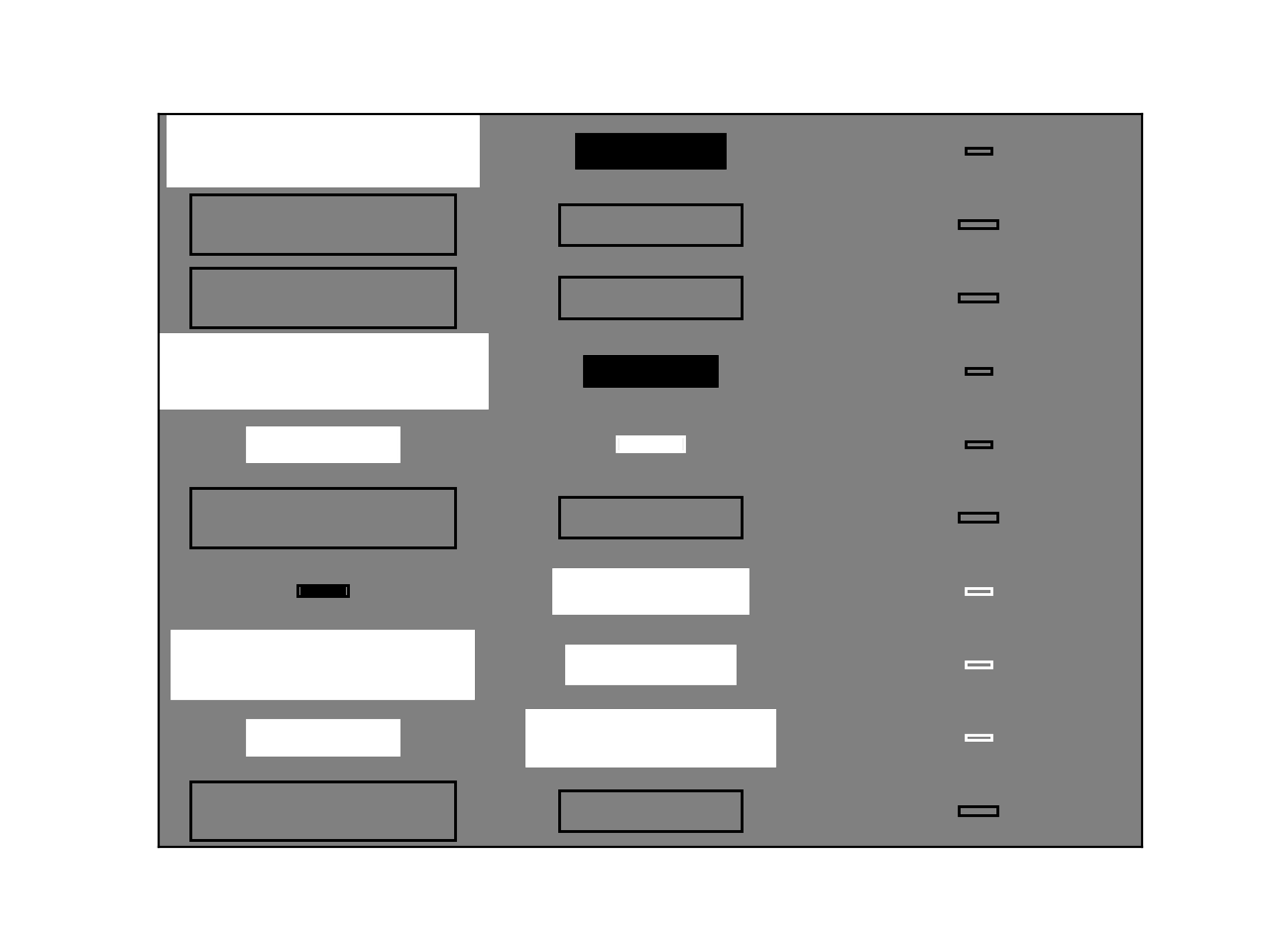
>>> bpplt.hinton(C)
(Source code, png, hires.png, pdf)

The diagram shows the elements of the matrix  . The size of the filled
rectangle corresponds to the absolute value of the element mean, and white and
black correspond to positive and negative values, respectively. The non-filled
rectangle shows standard deviation. From this diagram it is clear that the
third column of has been pruned out and the rows that were missing in
the data have zero mean and column-specific variance. The function
. The size of the filled
rectangle corresponds to the absolute value of the element mean, and white and
black correspond to positive and negative values, respectively. The non-filled
rectangle shows standard deviation. From this diagram it is clear that the
third column of has been pruned out and the rows that were missing in
the data have zero mean and column-specific variance. The function
hinton() is a simple wrapper for node-specific Hinton diagram plotters,
such as gaussian_hinton() and dirichlet_hinton(). Thus, the keyword
arguments depend on the node which is plotted.
Another plotting function is plot(), which just plots the values of the
node over one axis as a function:
>>> bpplt.pyplot.figure()
<matplotlib.figure.Figure object at 0x...>
>>> bpplt.plot(X, axis=-2)
(Source code, png, hires.png, pdf)
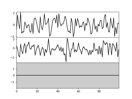
Now, the axis is the second last axis which corresponds to
 . As
. As  , there are three subplots. For Gaussian
variables, the function shows the mean and two standard deviations. The plot
shows that the third component has been pruned out, thus the method has been
able to recover the true dimensionality of the latent space. It also has
similar keyword arguments to
, there are three subplots. For Gaussian
variables, the function shows the mean and two standard deviations. The plot
shows that the third component has been pruned out, thus the method has been
able to recover the true dimensionality of the latent space. It also has
similar keyword arguments to plot function in matplotlib.pyplot. Again,
plot() is a simple wrapper over node-specific plotting functions, thus it
supports only some node classes.
Monitoring during the inference algorithm
It is possible to plot the distribution of the nodes during the learning algorithm. This is useful when the user is interested to see how the distributions evolve during learning and what is happening to the distributions. In order to utilize monitoring, the user must set plotters for the nodes that he or she wishes to monitor. This can be done either when creating the node or later at any time.
The plotters are set by creating a plotter object and providing this object to
the node. The plotter is a wrapper of one of the plotting functions mentioned
above: PDFPlotter, ContourPlotter, HintonPlotter or
FunctionPlotter. Thus, our example model could use the following
plotters:
>>> tau.set_plotter(bpplt.PDFPlotter(np.linspace(60, 140, num=100)))
>>> C.set_plotter(bpplt.HintonPlotter())
>>> X.set_plotter(bpplt.FunctionPlotter(axis=-2))
These could have been given at node creation as a keyword argument plotter:
>>> V = Gaussian([3, 5], [[4, 2], [2, 5]],
...              plotter=bpplt.ContourPlotter(np.linspace(1, 5, num=100),
...                                           np.linspace(3, 7, num=100)))
When the plotter is set, one can use the plot method of the node to perform
plotting:
>>> V.plot()
<matplotlib.contour.QuadContourSet object at 0x...>
Nodes can also be plotted using the plot method of the inference engine:
>>> Q.plot('C')
This method remembers the figure in which a node has been plotted and uses that
every time it plots the same node. In order to monitor the nodes during
learning, it is possible to use the keyword argument plot:
>>> Q.update(repeat=5, plot=True, tol=np.nan)
Iteration 19: loglike=-1.221354e+02 (... seconds)
Iteration 20: loglike=-1.221354e+02 (... seconds)
Iteration 21: loglike=-1.221354e+02 (... seconds)
Iteration 22: loglike=-1.221354e+02 (... seconds)
Iteration 23: loglike=-1.221354e+02 (... seconds)
Each node which has a plotter set will be plotted after it is updated. Note that this may slow down the inference significantly if the plotting operation is time consuming.
Posterior parameters and moments
If the built-in plotting functions are not sufficient, it is possible to use
matplotlib.pyplot for custom plotting. Each node has get_moments method
which returns the moments and they can be used for plotting. Stochastic
exponential family nodes have natural parameter vectors which can also be used.
In addition to plotting, it is also possible to just print the moments or
parameters in the console.
Saving and loading results
The results of the inference engine can be easily saved and loaded using
VB.save() and VB.load() methods:
>>> import tempfile
>>> filename = tempfile.mkstemp(suffix='.hdf5')[1]
>>> Q.save(filename=filename)
>>> Q.load(filename=filename)
The results are stored in a HDF5 file. The user may set an autosave file in
which the results are automatically saved regularly. Autosave filename can be
set at creation time by autosave_filename keyword argument or later using
VB.set_autosave() method. If autosave file has been set, the
VB.save() and VB.load() methods use that file by default. In order
for the saving to work, all stochastic nodes must have been given (unique)
names.
However, note that these methods do not save nor load the node definitions.
It means that the user must create the nodes and the inference engine and then
use VB.load() to set the state of the nodes and the inference engine. If
there are any differences in the model that was saved and the one which is tried
to update using loading, then loading does not work. Thus, the user should keep
the model construction unmodified in a Python file in order to be able to load
the results later. Or if the user wishes to share the results, he or she must
share the model construction Python file with the HDF5 results file.